Gina: gynecological care for those the doctor's office never knew how to receive
[ 2018–2021 · Graphic Design Biennial · BNDES Garagem · FIAP Top 20 ]
631 views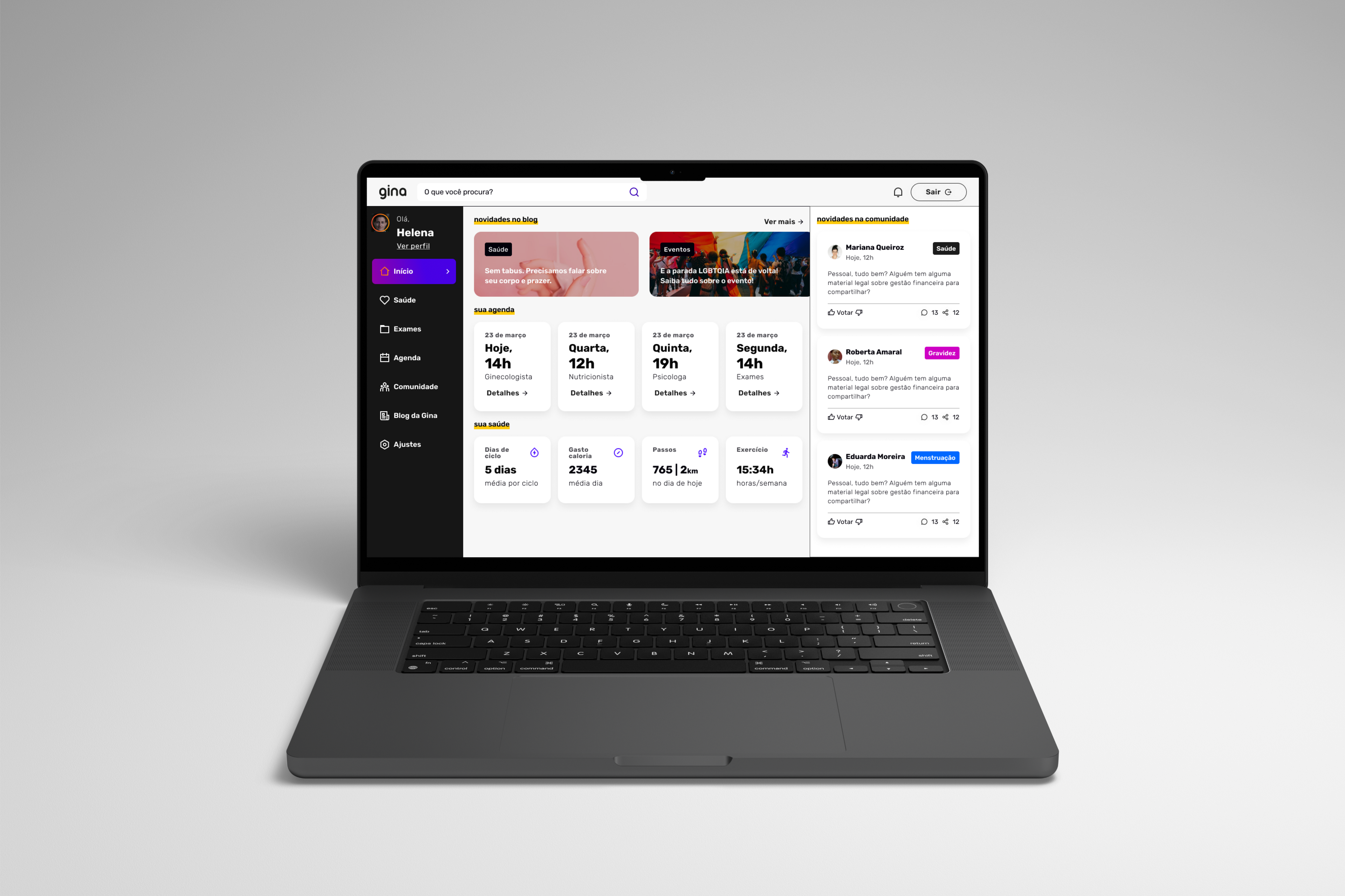
It was in 2018 that I first presented the project that would change my life. The question driving me was easy to ask and hard to answer: why can't a woman who has relationships with women find a doctor who knows how to care for her?
Gina was born from that question. It started as a final-year thesis, became a startup, went through an accelerator and won awards, and along the way stopped being an app and became an ecosystem that prepares, connects, and cares. This is the case of how that happened, and also of what didn't work.
The real problem
The starting point wasn't women's health in general. It was a specific, poorly served slice: lesbian and bisexual women, inside the gynecologist's office.
The numbers show the size of the gap. Only 47% of women who have relationships with women get an annual gynecological checkup. Among cisgender heterosexual women, the rate nearly doubles, around 76%. Until 2021, this was the only survey the Brazilian government produced about this population. Millions of people reduced to a single report.
The root of the problem wasn't only the patient who stops going to the doctor. It was the doctor who doesn't know how to receive her. Many professionals still repeat the idea that the lesbian body isn't at risk of infection because there's no penetration, an outdated and false belief. In the interviews I ran, I heard accounts of jokes during the exam, of a doctor insisting the patient "stop having relationships with women," of a refusal to order tests because the patient was considered a virgin. The result is predictable: the woman keeps switching doctors, or simply stops going.
A decision right at the start: opening it to all women
The first hard choice came before any screen. If the problem belonged to lesbian and bisexual women, the obvious instinct would be to build a product exclusively for them. That was exactly the path I rejected.
A service only for that audience would fall into what design theory calls the integrative paradigm: it treats the person as different, offers a separate solution, and in the end reinforces the separation it claimed to fight. I wanted the inclusive paradigm. I defined the audience as all women, regardless of orientation, and kept the content and care for women who have relationships with women inside the same space, no ghetto. Talking to heterosexual women confirmed the intuition: many of them also abandon their care because of trauma at the office. The pain was wider than the initial slice.
Listening before designing
Before designing anything, I went to listen. I interviewed seven lesbian and bisexual women, from different cities and social classes, and three specialist doctors. Then I ran a quantitative survey that brought in 253 responses from women across fifteen states.
The hardest finding came from the interviews: all seven women said they don't protect themselves during sex. Not out of carelessness, but for lack of reliable information on how to do it. The internet was the main source, with all the risk that carries.
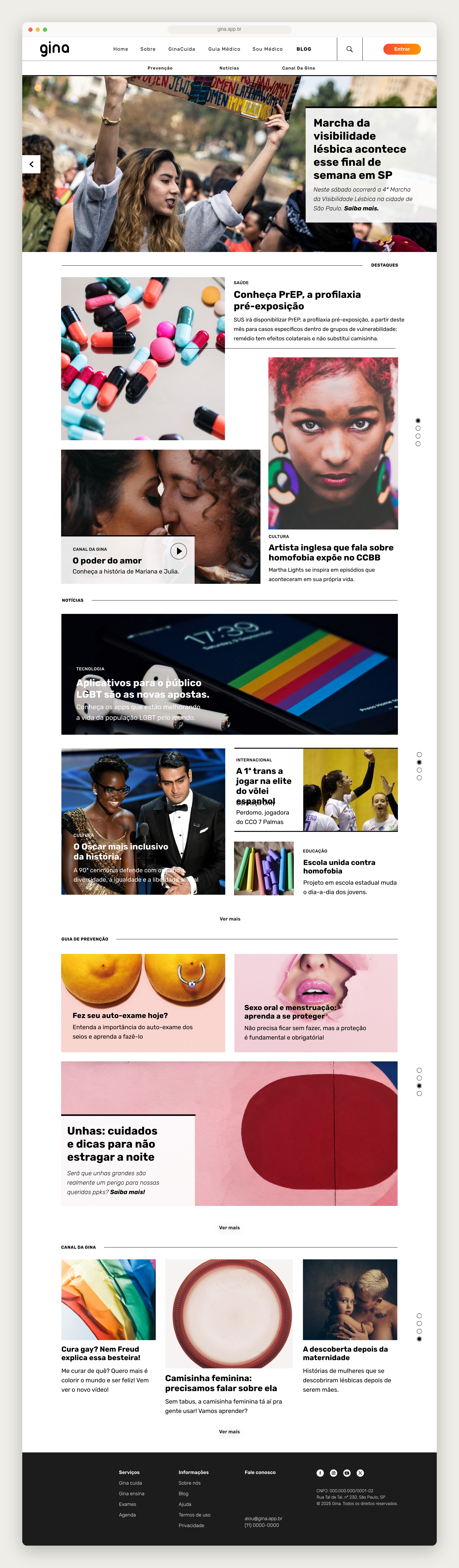
What the research made clear was a vacuum of reliable information, and the first answer to it was content. I designed an open area, in the format of a health newspaper, with an editorial line made for this audience and accessible to anyone, inside or outside an account. Keeping this content off the paywall was a deliberate decision: if the problem was access to information, charging for it went against the project's reason to exist.
On the doctors' side, the conclusion was even more revealing. Medical school doesn't teach the health and sexuality of lesbian, bisexual, or trans women. As one of the doctors I interviewed told me, gynecology textbooks were written by men, and so were the studies on the female body. The doctor isn't always acting in bad faith. Often they just lack the tools. That sentence changed the project, and I didn't yet know how much.
The choices that defined Gina
Patient first, doctor later
In the 2018 thesis, I made a conscious scoping decision: design the patient's journey first and leave the doctor's for later. I knew I was postponing the harder part, and I recorded that in the work itself. It was a choice, not an oversight.
Three years later, entering my MBA, that order flipped. The more I pressure-tested the solution, the more I saw that the shortest path to solving these women's pain didn't run through connecting them to good doctors. The real bottleneck was training: there weren't enough good professionals to connect anyone to.
From marketplace to ecosystem
Gina started as a marketplace. The premise was simple: good professionals exist, my job is to help the woman find them. That premise kept springing leaks. The seed of the answer was in my own 2018 research, when one of the doctors told me that what he valued most were "knowledge pills," short-format updates. It took me until 2021 to understand that this wasn't a detail. It was the core.
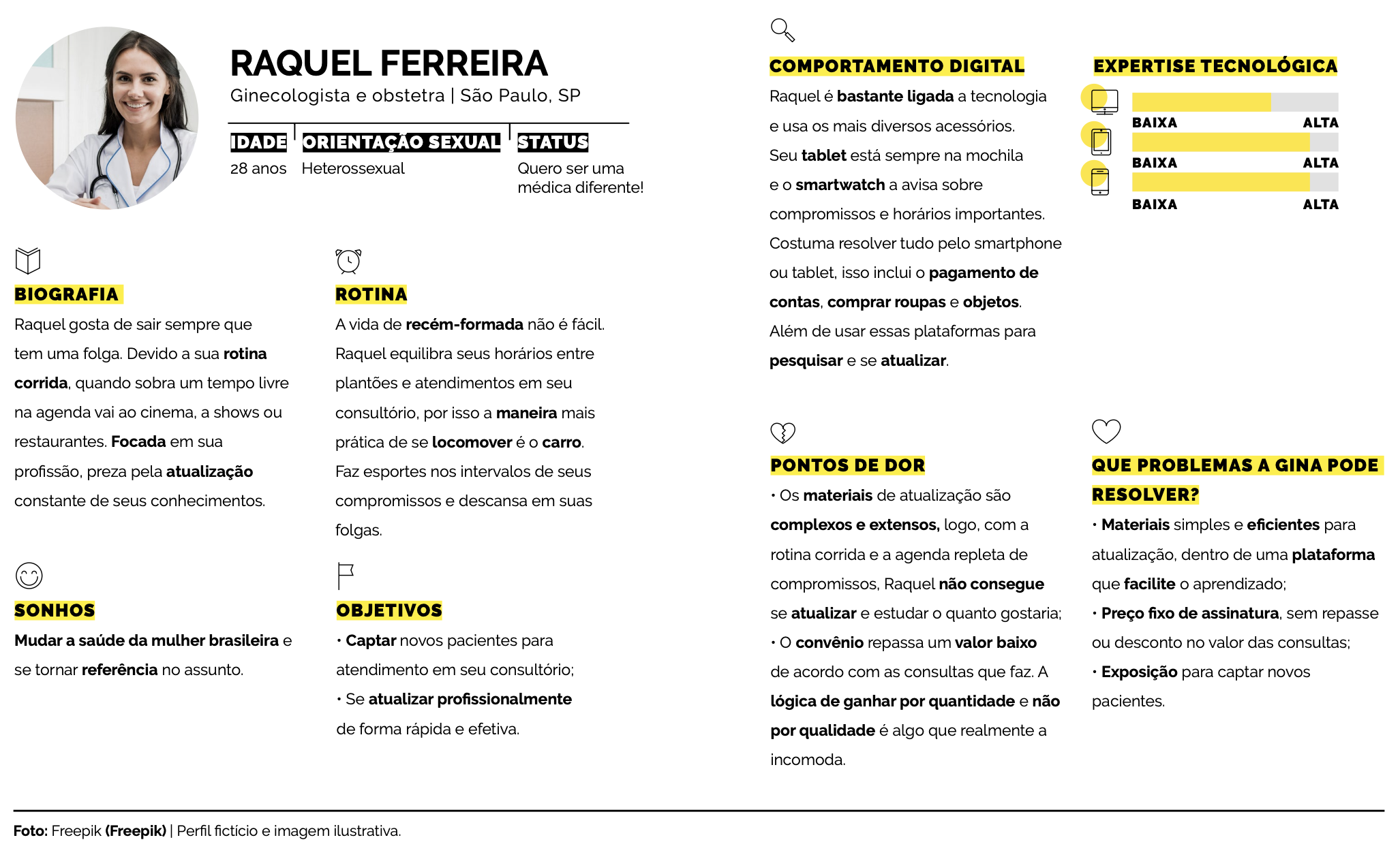
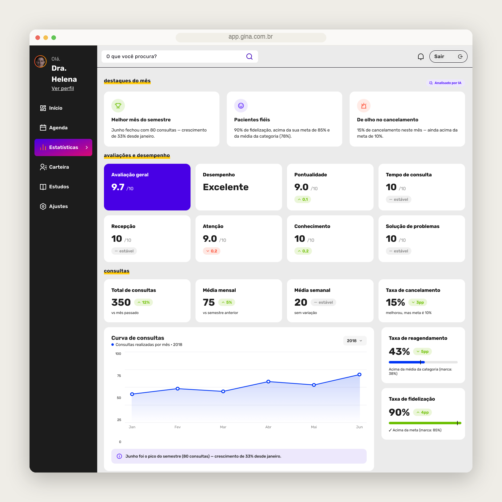
That's when ginaEnsina was born, the arm for training doctors, and that's when Gina stopped only connecting supply and started creating it. An app became an ecosystem that prepares the doctor, connects them to the patient, and cares for her over time. It grew in ambition and complexity, and I took on the cost.
The business model
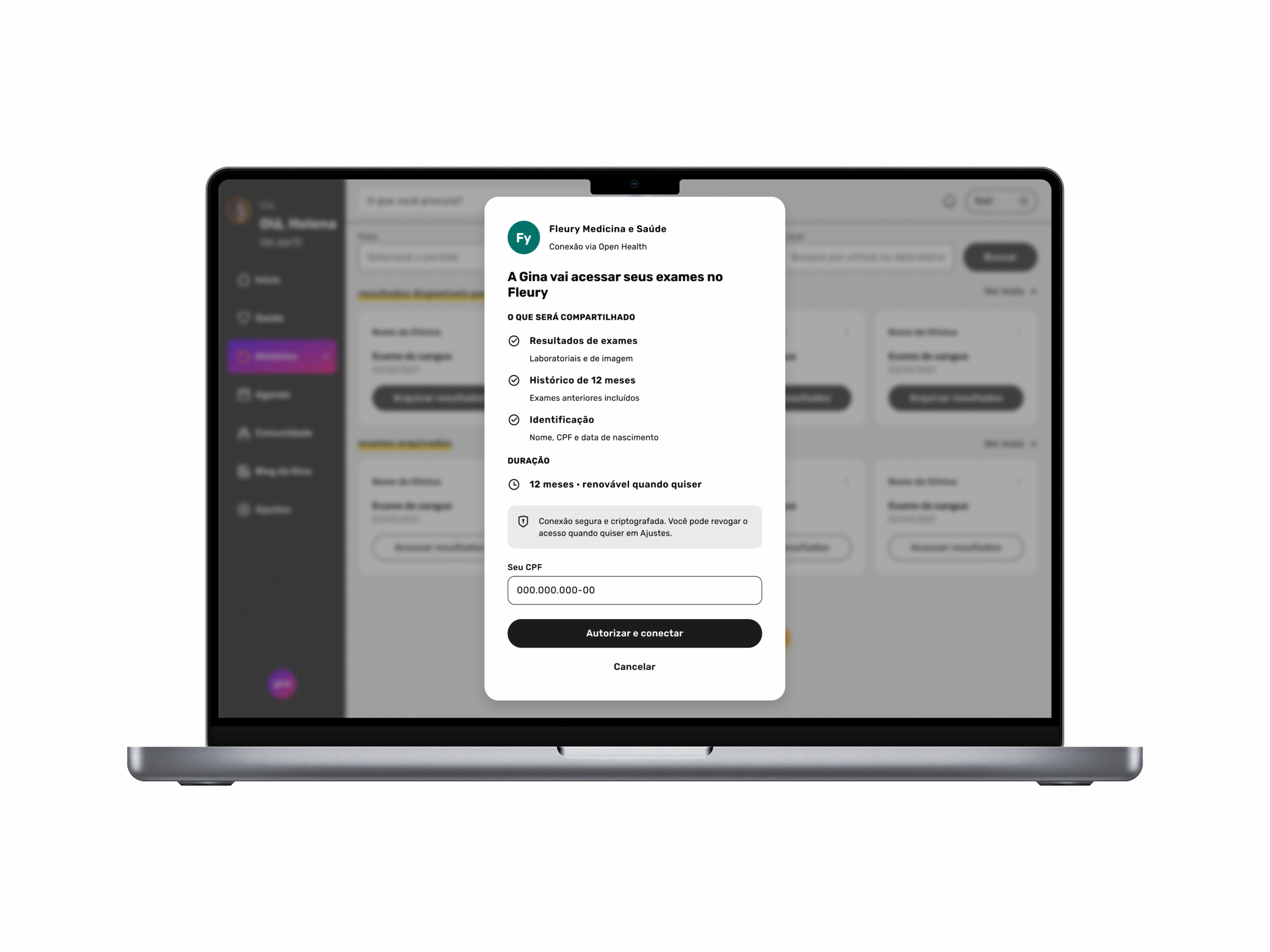
The business model was where I took the most hits, and also where I made the decisions I'm proudest of. I chose to charge the doctor a fixed monthly fee, without touching the price of the appointment and without a per-booking cut. The competition did the opposite, taking a percentage of every appointment booked. I didn't want to tax the care itself. I wanted a predictable cost that aligned Gina's interest with the doctor's instead of biting into their work.
The number that tied it all together was R$250. It worked as the price ceiling of the appointment for the subscribing patient and, at the same time, as the basis for the doctor's monthly fee. It didn't come from nowhere: it came from a real benchmark, the Coletivo Feminista de Saúde e Sexualidade, a São Paulo reference since the 1980s, which charges exactly that.
For the classic problem of any two-sided marketplace, the one where neither side shows up before the other, I had an answer on paper: monetize ginaEnsina first, the courses, and postpone the matching algorithm between doctor and patient until the base was robust enough for the match to make sense. On paper, it worked.
From research to screen
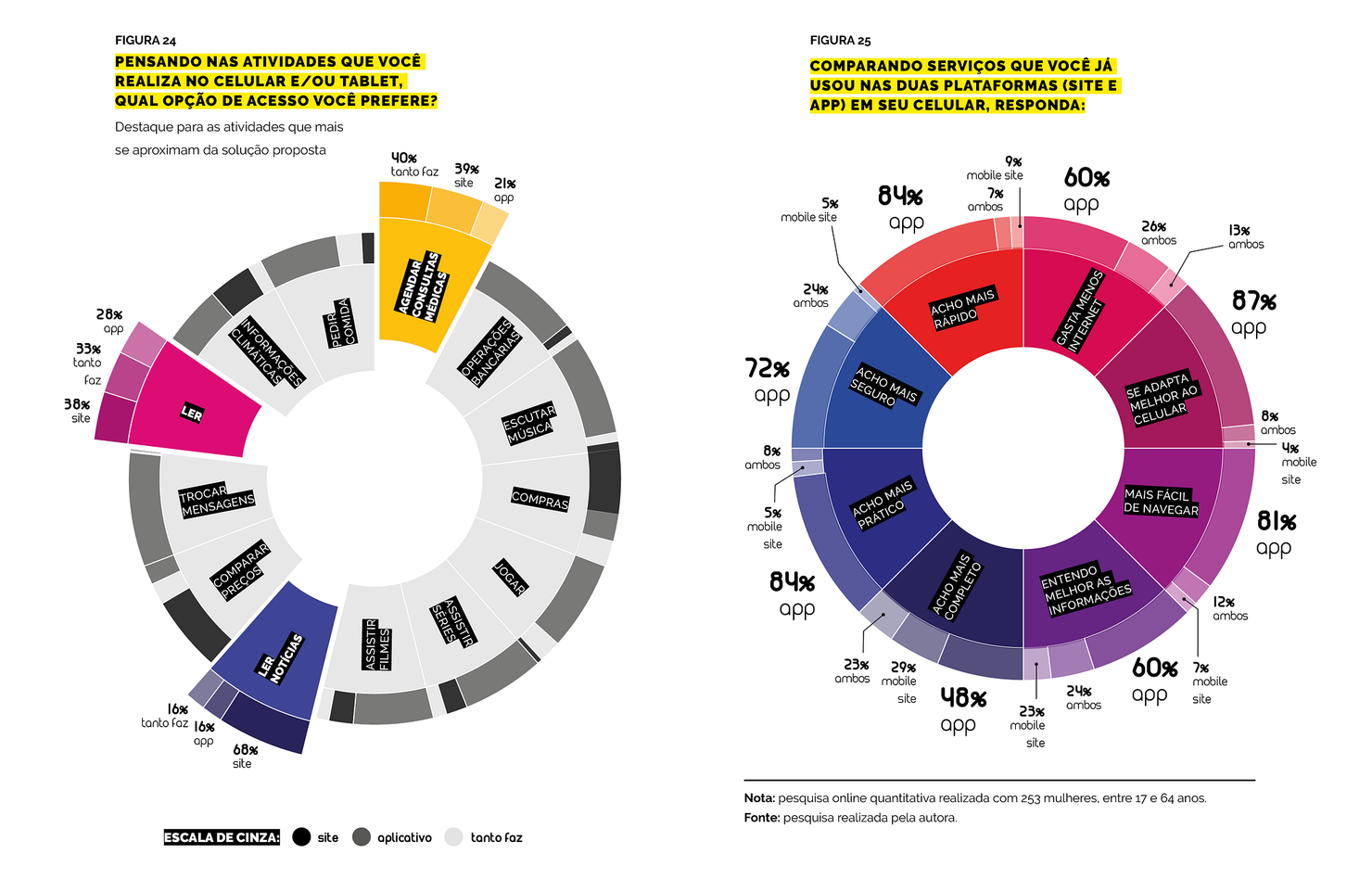
Gina's visible layer followed the same logic of grounded decisions. I chose a responsive Web App over a native app, backed by the research itself: users preferred to access it through the browser or didn't mind either way, even though they found the app faster. A site that works well on a phone solved it without forcing anyone to download anything.
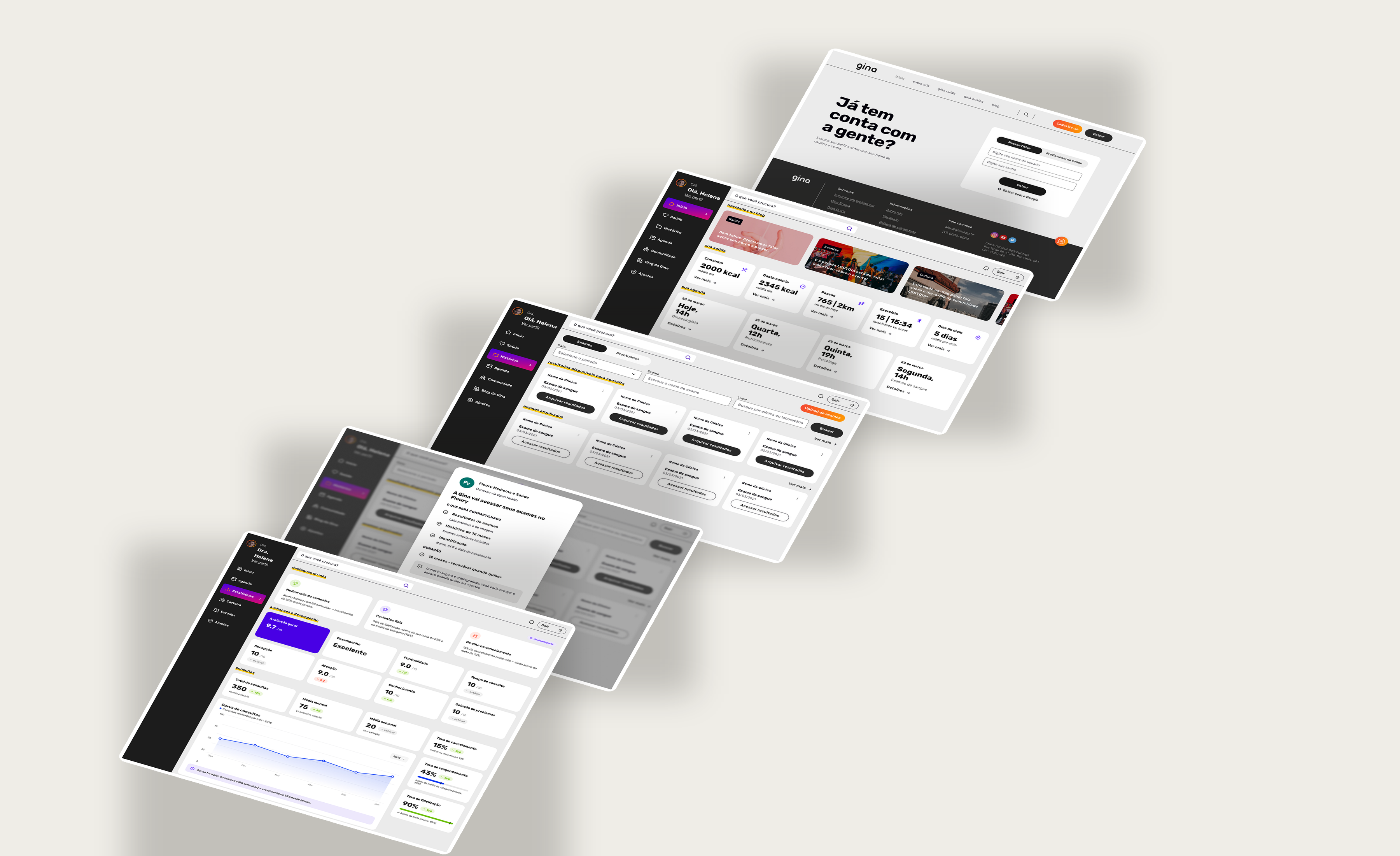
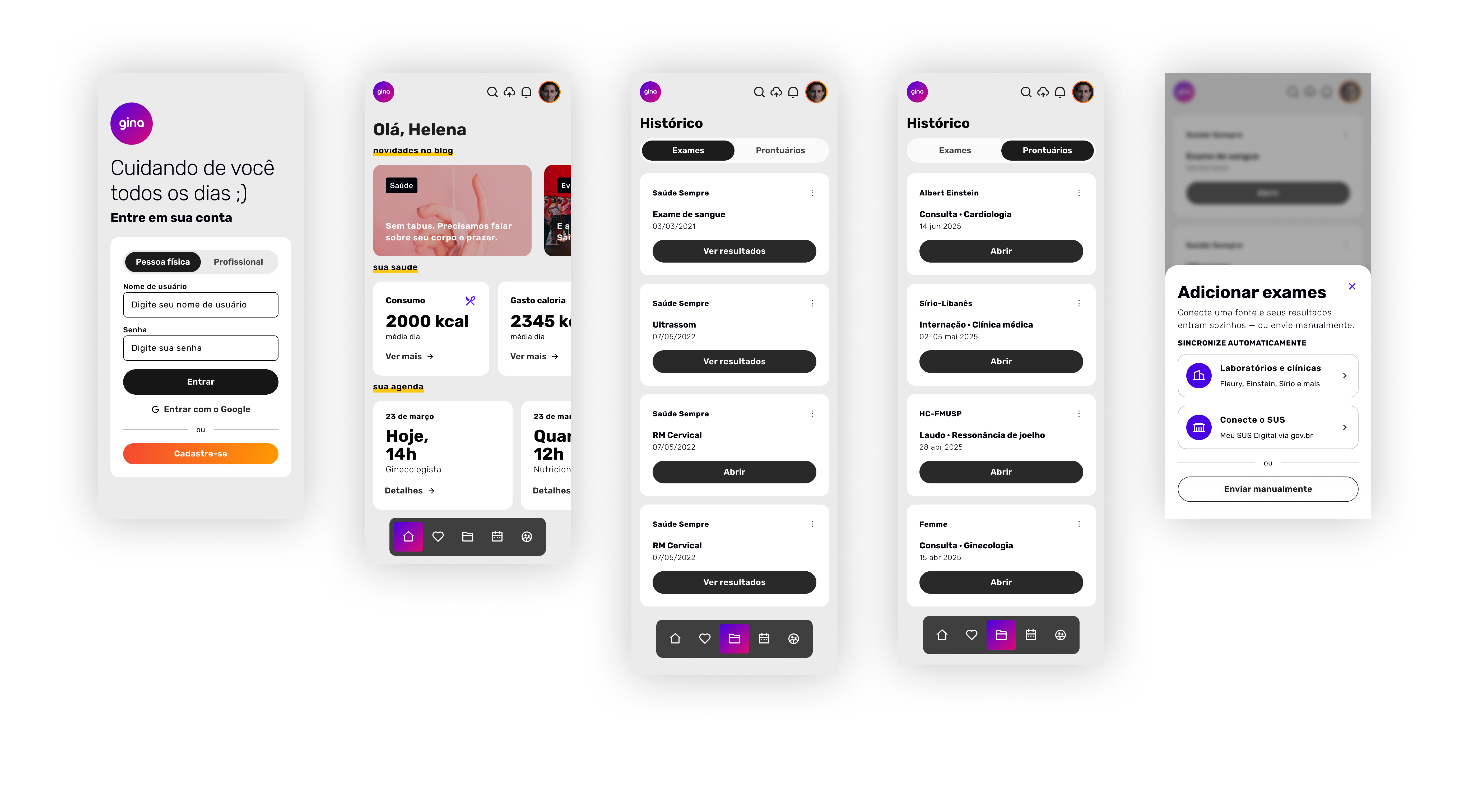
On the identity, I looked after the detail. The typography used a separate font just for the numerals, because the number height of the main font clashed with the letters and disrupted reading. The palette started from the colors of the bisexual flag and deliberately refused pink as a synonym for feminine. I organized everything in Atomic Design, with more than a hundred screens designed for three screen sizes.
I tested twice with users, and in one of the rounds I deliberately included a woman over 60, outside the target audience, to check real accessibility. That test told me the search needed to be by specialty, with no extra filters, and that a whole feature was missing: the menstrual cycle tracker was born from feedback, not from my plan. So was the exam drive. Not everything Gina became was in the original project, and that's a good sign.
What worked and what stalled
Gina went further than most portfolio projects reach. In 2019, it was selected for the 13th Brazilian Graphic Design Biennial. In 2020, it was pre-selected for BNDES Garagem and reached the accelerator's second-to-last stage. In 2021, it made the list of the twenty most innovative startups of the year at FIAP. This recognition didn't come only from a university panel; it came from an accelerator and from a market innovation award.
Even so, it didn't sustain itself. During the FIAP phase, I put together a volunteer team of around twenty people. I gathered good people around a purpose and got good feedback as a leader at the time, the team liked working with me. Even so, it fell apart. I scaled up a structure that didn't exist yet too fast, and people lost heart. That's where I learned, in practice, that purpose gathers a team but isn't what keeps a team standing. What keeps it standing is organization, rhythm, and clarity about what's expected of each person. It's one of the lessons I carry most, and it cost me dearly.
The monetization stalled along with it. The course's financial projection worked on paper, with profit in the first months. In reality, the content subscription didn't pay for itself and the doctors didn't show the interest I expected. The two-sided marketplace, that problem I had solved on paper, is still my biggest open challenge today.
I chose to tell this instead of hiding it. A project that won a Biennial, an accelerator spot, and an innovation award, and that still didn't find a model that paid for itself, teaches more than an invented happy ending would.
Where it left me
Gina started as a college project and became the work that shaped me as a designer. It forced me to research before having an opinion, to defend a stance, to design product with the business that sustains it in mind, and to look head-on at what didn't work. I won a Biennial, an accelerator spot, and an award, and still didn't find the model that would keep it standing. Both things are true at the same time, and that's why it's still the work I learn the most from. I still want to bring it fully to life.