Investment Platform: invest at any age
[ 2019 ]
278 views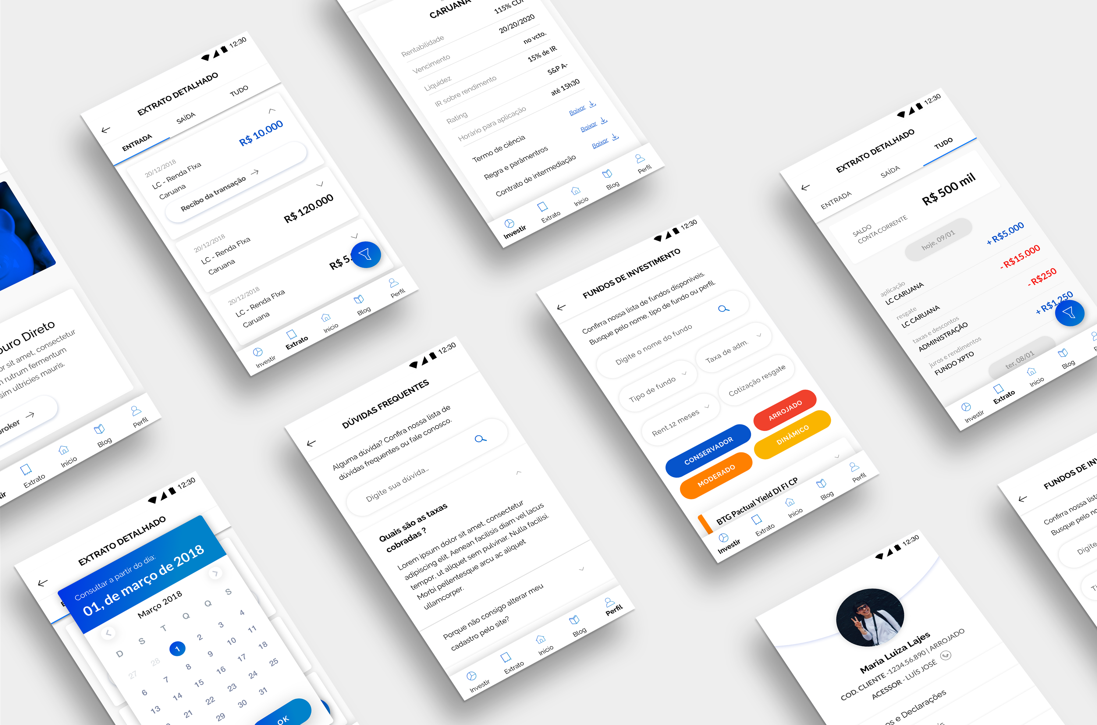
A brokerage with more than 23 years in the market brought me in to solve a problem it couldn't quite name yet. Clients could only reach their accounts through a website built for desktop only: a layout that didn't adapt to mobile, incompatibility with newer browsers, almost no interaction. The outcome was predictable. People logged in one to four times a month, just enough to check a balance and leave.
The mission was to turn that logged-in area into a space for self-service and self-management of investments, and with that, to attract an audience the brokerage didn't have yet. They called it a redesign. What was really at stake, though, was something else: how willing a 23-year-old company is to transform itself.
Three forces pulling at once
Before designing a single screen, I had to understand what constrained the ground. Three limits showed up, and none of them talked to the others.
The first was regulatory. Brazil's financial market is one of the most heavily regulated there is, and the requirement to be transparent with the client translates straight to the screen: warnings, confirmations, action trails that have to stay visible. Every flow carries a layer of mandatory information I couldn't just hide.
The second was the audience. The brokerage's analytics and internal research drew the person on the other side: a base between 50 and 70 years old, who logged into the account only a few times a month and, when something needed solving, preferred the phone. The house's best brokers served them by phone call, and it was that human relationship the client valued, not a screen. On the other side was the client the company wanted to win: the investor between 25 and 35, who handles everything through the app and has no patience for friction.
The third was organizational, and it was the one I underestimated. A 23-year-old house carries a culture, and that culture valued time-in-company above almost everything.
The platform: a Web App, not a native app
I weighed the options. Keeping the desktop site and just dressing it up was off the table, since it was the problem itself. A native app had appeal, but it ran into how people actually behaved: if someone opens their account one to four times a month, asking them to download and keep an app on their phone is friction that doesn't pay off.
I went with a Progressive Web App. The technology brings native-app qualities into the browser, so the experience feels close to an app without requiring a download, working well on both phone and desktop. And there was a plan behind it: if adoption was good, the structure would already be built and tested, ready to become a native app later without starting over.
Designing for the age extreme
This was the decision that defined the project. How do you serve, in the same interface, a person of nearly 70 who distrusts technology and a 30-year-old who gets impatient at any extra step?
I chose to design for the extreme user. If the interface works for the senior, it works for the younger one; the reverse rarely holds. So I prioritized the senior in every decision about usability, accessibility, and interface. The new audience wasn't left out, it came in through another door: the mere existence of a modern digital platform was already what would draw them in. The interface I optimized for whoever had the hardest time.
The research kept reminding me of one thing: the senior trusted the broker, the voice on the other end of the line, more than they'd trust a screen. Self-service couldn't arrive by shoving. It had to earn a place next to that habit, without forcing anyone off the phone. Designing for the extreme was also that: making the platform light and trustworthy enough for someone who had never asked for it.
In practice, that showed up in contrast, type size, and click area, all sized for people who see and tap with less precision.
The hardest point came from the clash between two of my constraints. Regulation forced me to put text on the screen. The senior user gets lost precisely when a screen has too much text. Two forces pushing in opposite directions, and I couldn't give in to either: the legal information had to be there, and the screen had to breathe.
I solved it with hierarchy and with breaking things up. I organized each screen to separate what was essential for deciding from what was legal obligation, and I split the experience across more screens instead of stacking everything into one. That has a cost, and I knew it: more screens mean more steps, more taps, something we usually avoid. For this audience, the trade was worth it. I chose more steps over more load in each step.
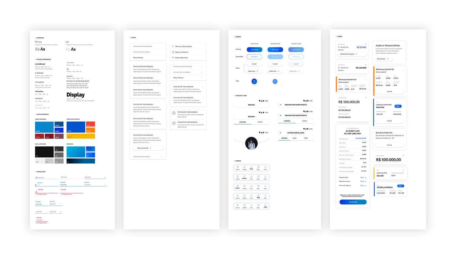
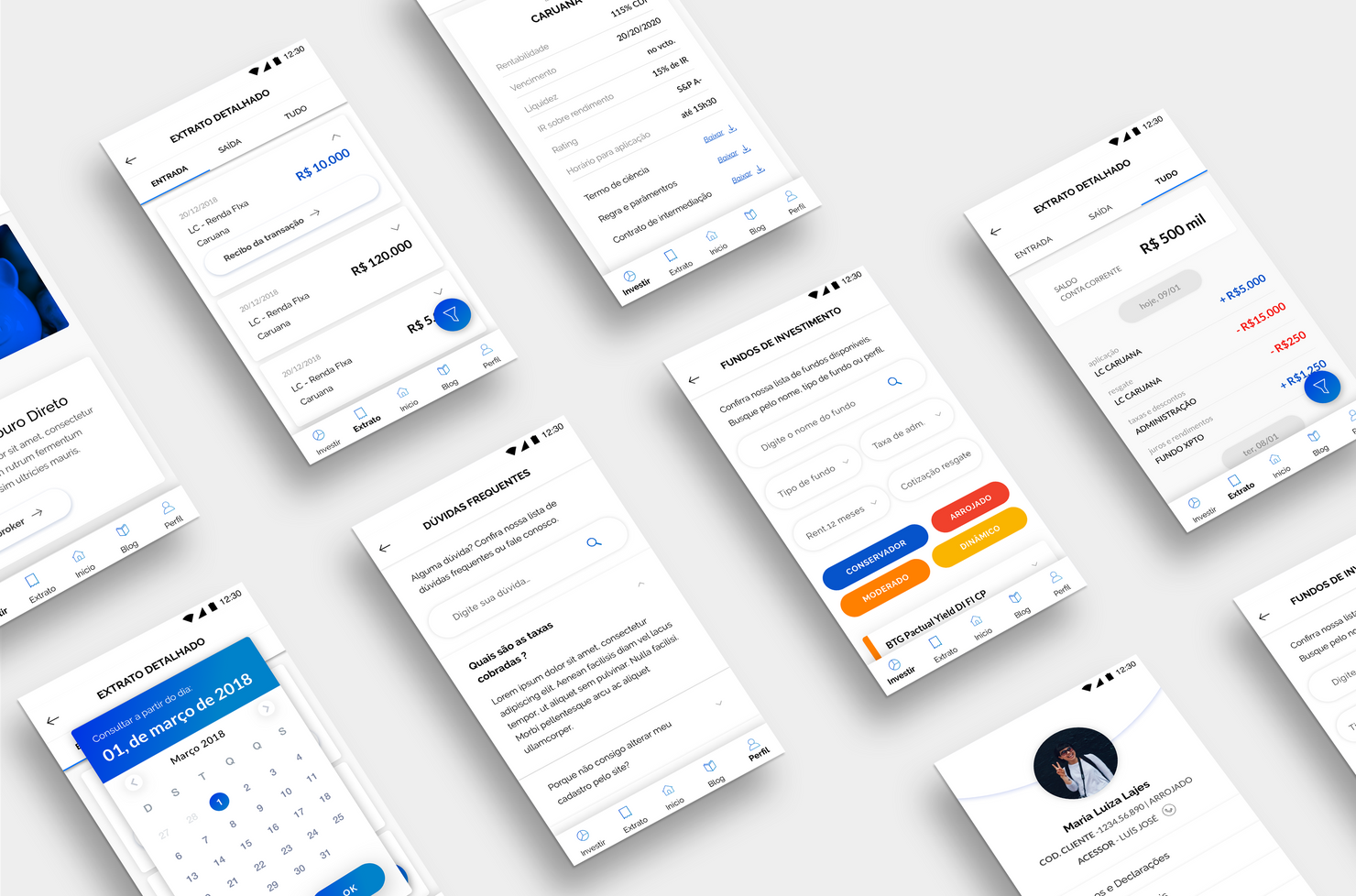
The whole identity came out of a design system, documented in a style guide to keep every screen consistent. Choosing white as the base color came from the same accessibility logic: more contrast, more legibility. The typefaces had a slightly larger x-height than usual, which helps reading.
What stalled the project
The biggest friction didn't come from users. It came from the inside.
The resistance concentrated in one person: the in-house developer, many years with the company, who didn't want to touch anything. He argued for keeping the old desktop site, wouldn't accept the app, and kept saying it "couldn't be done," always hitting the technology legacy.
I didn't treat it as stubbornness. I sat next to him, asked about the data, about the platforms, about how everything was organized. I even sketched drafts alongside him, to understand the legacy from the inside and find a path that fit what was already there. I learned a lot about the house's real technical constraints there. But the refusal ran deep, and at his level I couldn't break it.
I took the project straight to the CEO and presented the whole proposal. And even so, it didn't move forward.
What was finished, and what wasn't
I need to be honest about the outcome, because that's where the lesson comes from.
The project was finished end to end. User research and interviews, design system, style guide, every flow and every screen. It was a whole product, ready to be built. I did it on my own, with the support of my manager and my director at the time, a moral support, cheering me on, not doing the work.
And it was shelved. Nothing was ever developed.
The project fell inside the company, not on the design table: it didn't interest anyone at that moment, the technological mindset wasn't there, and in a culture where time-in-company weighed more than the will to change, something that touched everything had nothing to hold on to at the top.
What I learned
The lesson from this project is the one I carry the most to this day: digital transformation doesn't move bottom-up. However complete, tested, and well resolved a project may be, it only happens if the company's leadership is genuinely committed to changing. Moral support doesn't move legacy. Neither does a good argument in a meeting with the CEO, when the company doesn't truly want to transform.
Today, before designing the solution, I dig into how willing the organization is to back it. It was this shelved project that taught me to ask that question first.